This guide is an introduction to Matplotlib, where users learn the types of plots and experiment with them. The fundamental concepts and terminologies of Matplotlib are also introduced. Next, we will learn how to change the “look and feel” of plots. Finally, users will be introduced to other toolkits that extend Matplotlib. Most of the tutorial derives from the from the Anatomy of Matplotlib SciPy 2017 Tutorial by Ben Root and Anatomy of Matplotlib SciPy 2018 Tutorial by Ben Root & Hannah Aizenman, both available on YouTube. The notebooks used in the tutorial are located at this repository.
Introduction #
The original Jupyter Notebook is here: Part 1 - Figures, subplots and layouts.
matplotlib.pyplot is a collection of command style functions that make Matplotlib work like MATLAB. You need to load (as known as import) the matplotlib.pyplot module to be able to plot anything in Matplotlib. Here the numpy module is imported as well, since it turns out to be very helpful as we will see later. The command %matplotlib inline shows figures inline in Jupyter Notebooks.
import numpy as np
import matplotlib.pyplot as plt
%matplotlib inline # only for Jupyter notebooks
%matplotlib notebook # only for Jupyter notebooks
The first thing you need to do is set an instance of the Figure class, saved here as fig. To create a figure, run:
fig = plt.figure()
plt.show()
By default, Matplotlib will not show anything until you call plt.show(). These basic commands will show you a blank figure with no plots.
Axes #
The fig instance has a few interesting options, such as figaspect, which allows you to set an aspect ratio.
# Width and height in figure
fig = plt.figure(figsize = (width, height))
# This will create a figure twice as high as wide.
fig = plt.figure(figsize = plt.figaspect(2.0))
Once you define an instance of the Figure class, all plotting is done with respect to an Axes object, which refers to the axes part of a figure.
fig = plt.figure()
ax = fig.add_subplot(111)
ax.set(xlim=[0.5, 4.5], ylim=[-2, 8], title='An Example Axes', xlabel='X axis', ylabel='Y axis')
plt.show()
Notice the call to set. Objects in Matplotlib typically have lots of “explicit setters” — in other words, functions that start with set_<something> and control a particular option. You can also use ax.set_ commands individually.
ax.set_xlim([0.5, 4.5])
ax.set_ylim([-2, 8])
ax.set_title('An Example Axes')
ax.set_xlabel('X Axis')
ax.set_ylabel('Y Axis')
Basic plotting #
All of your plotting will be done with the Axes class. This removes ambiguity because you define which axis you’re plotting on, which will be helpful with multiple plots. plot draws points with lines connecting them, scatter draws unconnected points.
fig = plt.figure()
ax = fig.add_subplot(111)
ax.plot([1, 2, 3, 4], [10, 20 , 25, 30], color='lightblue', linewidth=3)
ax.scatter([0.3, 3.8, 1.2, 2.5], [11, 25, 9, 26], color='darkgreen', marker='^')
ax.set_xlim([0.5, 4.5])
plt.show()
Multiple axes #
A figure can have more than one axis if you want to plot your figures.
fig, axes = plt.subplots(nrows=2, ncols=2)
axes[0, 0].set(title='Upper Left') # sets title in upper left plot
axes[0, 1].set(title='Upper Right')
axes[1, 0].set(title='Lower Left')
axes[1, 1].set(title='Lower Right')
Iterate over all items in a multidimensional array to remove ticks on every axis.
for ax in axes.flat:
# remove ticks by setting options with empty arrays
ax.set(xticks=[], yticks=[])
plt.show()NOTICE: in the newest version of Matplotlib, this
fig = plt.figure()
ax = fig.add_subplot(111)
is equivalent to:
fig, ax = plt.subplots() # default is one row and one columnVisual overview of plotting functions #
The original Jupyter Notebook is here: Part 2 - Plotting methods overview.
The basics #
1D series/points #
There are many plotting features in Matplotlib, such as:
plot: line and/or markers,scatter: colored/scaled markers,bar: rectangle plot,fill/fill_between/stackplot: filled polygons.
ax.plot(x, y) and ax.scatter(x, y) draw lines and points, respectively. ax.plot(x, y) and ax.scatter(x, y) are both good for plotting markers, but ax.scatter(x, y) is more powerful if you want to exercise greater control over the markers, such as coloring the markers or changing their sizes according to other data. For simple cases with markers, ax.plot(x, y) without the line will do fine.
2D arrays/images #
imshow: colormapped or RGB arrays,pcolor/pcolormesh: colormapped 2D array,contour, contourf, clabel: contour/label 2D data,
Vector fields #
arrow/quiver/streamplot: vector fieldshist/boxplot/violinplot: statistical plotting
Data distributions #
hist/boxplot/violinplot: statistical plotting
Detailed examples (of a few of these) #
matplotlib’s ax.bar(...) method can also plot general rectangles, but the default is optimized for a simple sequence of x, y values, where the rectangles have a constant width. There’s also ax.barh(...) (for horizontal), which makes a constant-height assumption instead of a constant-width assumption.
Bar plots, ax.bar(…) and ax.barh(…) #
np.random.seed(1)
x = np.arange(5)
y = np.random.randn(5)
fig, axes = plt.subplots(ncol=2, figsize=plt.figaspect(1./2))
vert_bars = axes[0].bar(x, y, color='lightblue', align='center')
horiz_bars = axes[1].barh(x, y, color='lightblue', align='center')
axes[0].axhline(0, color='blue', linewidth=2)
axes[1].axvline(0, color='green', linewidth=2)
plt.show()
You can capture the output of both axes methods, but it isn’t necessary unless you need to do some extra operations on them. Matplotlib will destroy the figures only when you close them, regardless of whether you captured the axes output.
Filled regions, fill_between(…) with data keyword argument #
With the data keyword argument feature, one can pass in a single dictionary-like object as data, and use the string key names in the place of the usual input data arguments.
x = np.linspace(0, 10, 200)
data_obj = {'x': x,
'y1': 2 * x + 1,
'y2': 3 * x + 1.2,
'mean': 0.5 * x * np.cos(2*x) + 2.5 * x + 1.1}
fig, ax = plt.subplots()
ax.fill_between('x', 'y1', 'y2', color='yellow', data=data_obj)
ax.plot('x', 'mean', color='black', data=data_obj)
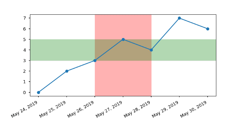
plt.show()Time series data plot #
This example is taken from Corey Schafer’s YouTube video - Matplotlib Tutorial (Part 8): Plotting Time Series Data.
import matplotlib.pyplot as plt
import matplotlib.dates as mpl_dates
from datetime import datetime

# uses 'seaborn-v0_8-talk' plotting style
plt.style.use('seaborn-v0_8-talk')

# data
dates = [datetime(2019, 5, 24), datetime(2019, 5, 25), datetime(2019, 5, 26), datetime(2019, 5, 27), datetime(2019, 5, 28), datetime(2019, 5, 29), datetime(2019, 5, 30)]
y = [0, 2, 3, 5, 4, 7, 6]

fig, ax = plt.subplots(figsize=(10, 5))

# check link below for format codes
date_format = mpl_dates.DateFormatter('%b %d, %Y')
# 'gca' stands for 'get current axis'
ax.xaxis.set_major_formatter(date_format)
# Add a vertical red shaded region
ax.axvspan(datetime(2019, 5, 26), datetime(2019, 5, 28), color='red', alpha=0.3)
# Add a horizontal green shaded region
ax.axhspan(3, 5, color='green', alpha=0.3)
# 'gcf' stands for 'get current format'
plt.gcf().autofmt_xdate()
ax.plot_date(dates, y, linestyle='solid')
plt.savefig('time_series.png')
See strftime() and strptime() Behavior – Python3 docs. If you want to highlight a certain rectangular region of the plot, use the axvspan and axhspan methods.
Input data, 2D arrays or images #
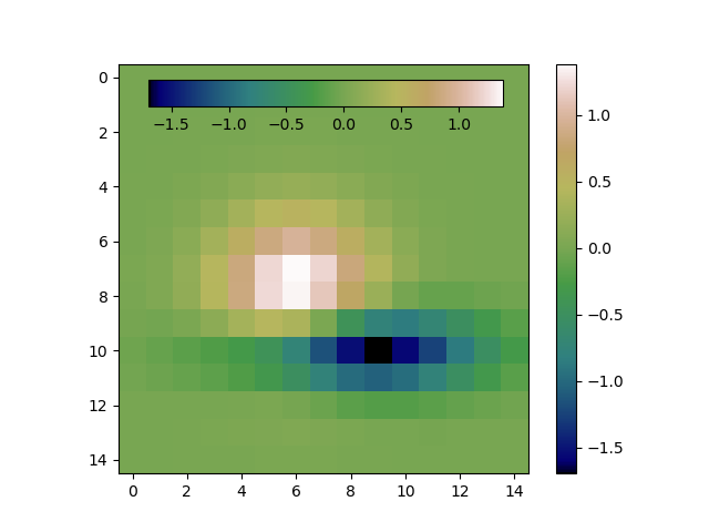
Colorbars #
This code shows two colorbars, one of which is within the plot in order to recover some space. Notice that colorbar is a Figure class object and not an Axes class object.
import matplotlib.pyplot as plt
from matplotlib.cbook import get_sample_data
data = get_sample_data('axes_grid/bivariate_normal.npy')
fig, ax = plt.subplots()

# inner colorbar
cax = fig.add_axes([0.21, 0.8, 0.5, 0.05])
im = ax.imshow(data, cmap='gist_earth')
fig.colorbar(im, cax=cax, orientation='horizontal')

# right colorbar
cbar = fig.colorbar(im)
cbar.ax.yaxis.set_tick_params(pad=10)
plt.show()
The fig.add_axes object takes as default a tuple of coordinates, (left, bottom, width, height). In addition, extra padding was added to the outer colorbar labels by setting cbar.ax.yaxis.set_tick_params(pad=5). You can read more about colorbar label padding at this link.
Saving plots to file #
You can save the active figure using plt.savefig. This method is equivalent to the figure object’s savefig instance method.
plt.savefig('figpath.svg')The type of file is inferred from the extension. There are a couple of important options: dpi for graphics and bbox_inches to trim the whitespace around the actual figure.
plt.savefig('figpath.png', dpi=400, bbox_inches='tight')How to speak “MPL” #
This section will go over many of the properties that are used throughout the library, in other words it’ll teach you the “language” of Matplotlib. The original Jupyter Notebook is here: Part 3 - How to speak MPL.
Colors #
Matplotlib supports a very robust language for specifying colors that should be familiar to a wide variety of users (See: Colors - matplotlib).
Base colors #
This plots a list of the named colors supported in matplotlib. Note that xkcd colors are supported as well, but are not listed here for brevity.
From the latest stable release of matplotlib: List of named colors – matplotlib.
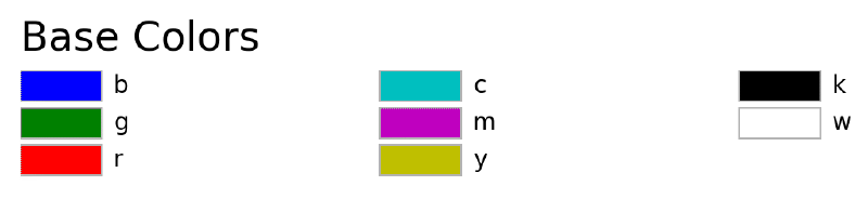
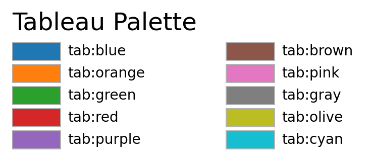
Tableau palette #
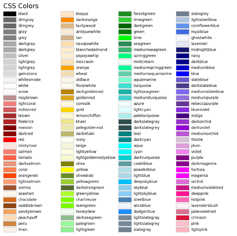
CSS colors #
Hex values #
Colors can also be specified by supplying a HTML/CSS hex string, such as #0000FF for blue. Support for an optional alpha channel was added in v2.0.
256 shades of gray #
A gray level can be given instead of a color by passing a string representation of a number between 0 and 1, inclusive. ‘0.0’ is black, while ‘1.0’ is white. ‘0.75’ would be a light shade of gray.
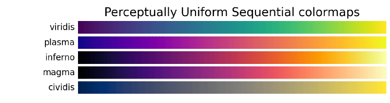
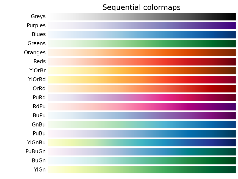
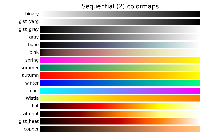
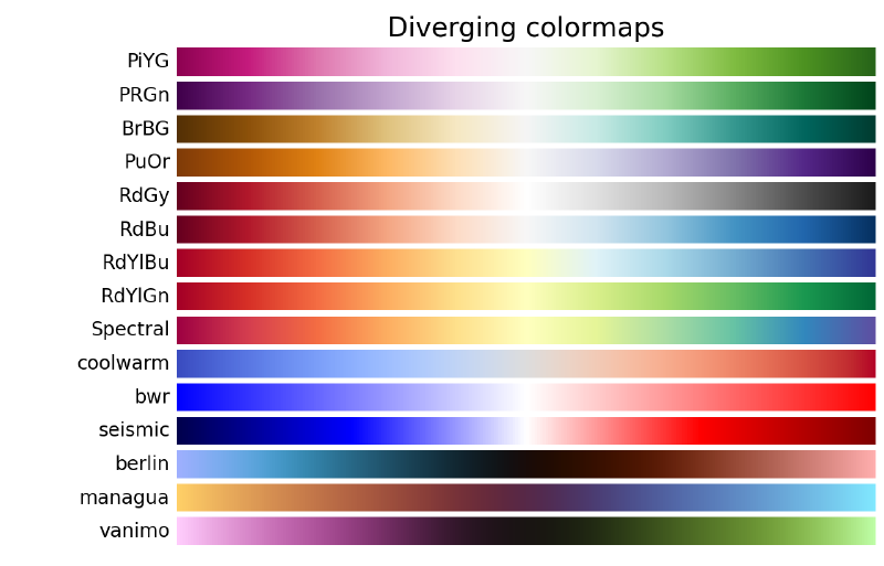
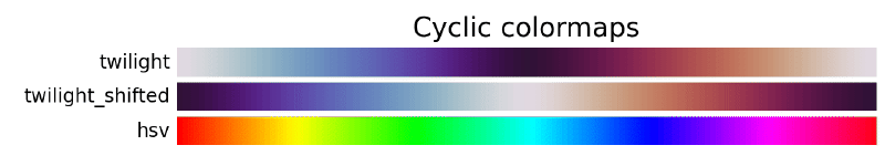
Colormaps #
The job of the colormap is to relate a scalar value to a color. The v2.0 release of Matplotlib adopted a new default colormap, “viridis”, over the previous default “jet”. The colormaps available in Matplotlib can be accessed at: Reference for colormaps included with Matplotlib – matplotlib documentations.
When using matplotlib.pyplot, the colormap and its colors can be accessed with the following code,
import matplotlib.pyplot as plt
plt.cm.get_cmap(<colormap_name>).colors # colormap name is a string
# or equivalently
plt.cm.<colormap_name>.colors
plt.cm.get_cmap(<colormap_name>) is deprecated starting from Matplotlib 3.7. A personal favorite colormap of mine is Paired, although viridis is also high on my list.
Instead of using matplotlib.pyplot one can use,
import matplotlib as mpl
cmap = mpl.colormaps['viridis'] # or your favorite colormap
# or
cmap = mpl.colormaps.get_cmap('viridis')
From matplotlib.cm – matplotlib documentations.
Colormap names #
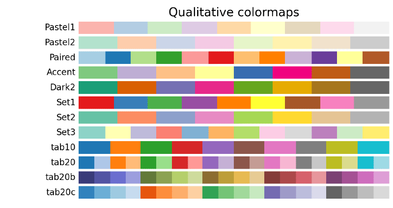
I’ve also made a modified Paired colormap, using a deeper hue of yellow (#FFD700). The colormap can be access using the code below.
colormap = ['#A6CEE3', '#1F78B4', '#B2DF8A', '#33A02C',
            '#FB9A99', '#E31A1C', '#FDBF6F', '#FF7F00',
            '#CAB2D6', '#6A3D9A', '#FFD700', '#B15928']
cmap = mpl.colors.ListedColormap(colormap)
Markers #
Markers are commonly used in plot() and scatter() plots, but also show up elsewhere. There is a wide set of markers available, and custom markers can even be specified (See: Markers API - matplotlib).
All of the plot customizations can be accessed through the properties of the matplotlib.lines.Line2D class.
| marker | description | marker | description | marker | description | marker | description |
|---|---|---|---|---|---|---|---|
| “.” | point | “+” | plus | “,” | pixel | “x” | cross |
| “o” | circle | “D” | diamond | “d” | thin_diamond | ‘$…$’ | mathtext |
| “8” | octagon | “s” | square | “p” | pentagon | “*” | star |
| “|” | vertical line | “_” | horizontal line | “h” | hexagon1 | “H” | hexagon2 |
| TICKLEFT | tickleft | CARETLEFT | caretleft | “<” | triangle_left | “3” | tri_left |
| TICKRIGHT | tickright | CARETRIGHT | caretright | “>” | triangle_right | “4” | tri_right |
| TICKUP | tickup | CARETUP | caretup | “^” | triangle_up | “2” | tri_up |
| TICKDOWN | tickdown | CARETDOWN | caretdown | “v” | triangle_down | “1” | tri_down |
| “None” | nothing | None | nothing | " " | nothing | "" | nothing |
You can specify each point in a scatter plot with an individual marker of different type and color. The following two calls yield identical results.
plot(x, y, 'go--', linewidth=2, markersize=12)
plot(x, y, color='green', marker='o', linestyle='dashed', linewidth=2, markersize=12)
You can also specify multiple plots each with its own markers.
t = np.arange(0.0, 5.0, 0.2)
plt.plot(t, t, '*y', t, t**2, '8m', t, t**3, 'sg') # yellow star, magenta octagon, green square
plt.show()
Linestyles #
Line styles are about as commonly used as colors. There are a few predefined linestyles available to use. Note that there are some advanced techniques to specify some custom line styles. Here is an example of a custom dash pattern.
| linestyle | description |
|---|---|
| “-” | solid |
| “–” | dashed |
| “-.” | dashdot |
| “:” | dotted |
In polygons, you can specify the line style with the ls option in words (ls='dashed') or shorthand notion (ls='--').
Plot attributes #
Matplotlib will normally cycle the colors for each dataset you plot. However, you are free to explicitly state which colors you want used for which plots. For plt.plot(), you can mix the specification for the colors, linestyles, and markers in a single string.
t = np.arange(0.0, 5.0, 0.2)
plt.plot(t, t, '-', t, t**2, '--', t, t**3, '-.', t, t**4, '.-', t, -t, ':')
plt.show()
Here’s a table of common attributes for Matplotlib:
| Property | Value Type |
|---|---|
| alpha | float |
| color or c | any matplotlib color |
| dash_capstyle | [‘butt’, ‘round’, ‘projecting’] |
| dash_joinstyle | [‘miter’, ‘round’, ‘bevel’] |
| dashes | sequence of on/off ink in points |
| drawstyle | [ ‘default’, ‘steps’, ‘steps-pre’, ‘steps-mid’, ‘steps-post’] |
| linestyle or ls | [’-’, ‘–’, ‘-.’, ‘:’, ‘None’, ’ ‘, ‘’] and any drawstyle with a linestyle, e.g. ‘steps–’. |
| linewidth or lw | float value in points |
| marker | [0, 1, 2, 3, 4, 5, 6, 7, ‘o’, ’d’, ‘D’, ‘h’, ‘H’, ‘’, ‘None’, ’ ‘, None, ‘8’, ‘p’, ‘,’, ‘+’, ‘x’, ‘.’, ’s’, ‘*’, ‘_’, ‘|’, ‘1’, ‘2’, ‘3’, ‘4’, ‘v’, ‘<’, ‘>’, ‘^’ ] |
| markeredgecolor or mec | any matplotlib color |
| markeredgewidth or mew | float value in points |
| markerfacecolor or mfc | any matplotlib color |
| markersize or ms | float |
| solid_capstyle | [‘butt’, ‘round’, ‘projecting’] |
| solid_joinstyle | [‘miter’, ‘round’, ‘bevel’] |
| visible | [True, False] |
| zorder | any number |
Mathtext #
You can use a subset TeX markup in any Matplotlib text string by placing it inside a pair of dollar signs ($). Note that you do not need to have TeX installed, since Matplotlib ships its own TeX expression parser, layout engine and fonts. Since backslashes are prevelent in LaTeX, it is often a good idea to prepend an r to your string literal so that Python will not treat the backslashes as escape characters.
import matplotlib.pyplot as plt
plt.scatter([1, 2, 3, 4], [4, 3, 2, 1])
plt.title(r'$\sigma_i=15$', fontsize=20)
plt.show()
Property cycles #
When you do multiple plot calls in the same axes — and not specify any colors — the color for each plot is different! The default style in Matplotlib will cycle through a list of colors if you don’t specify any.
Now from v1.5, you can cycle linestyles, markers, hatch styles — just about any property that can be specified is now possible to be cycled. Here is a basic example that will work for v2.0 or greater.
import matplotlib as mpl
from matplotlib.rcsetup import cycler
mpl.rc('axes', prop_cycle=cycler('color', 'rgc') +
                          cycler('lw', [1, 4, 6]) +
                          cycler('linestyle', ['-', '-.', ':']))
t = np.arange(0.0, 5.0, 0.2)
plt.plot(t, t)
plt.plot(t, t**2)
plt.plot(t, t**3)
plt.show()
Managing matplotlib with matplotlibrc #
Matplotlib uses the matplotlibrc configuration file to define the plethora of defaults found in the library, where you can control the defaults of almost every property. Just modify your rc file and re-run your scripts to produce your improved figures.
To display where the currently active matplotlibrc file was loaded from, one can do the following:
import matplotlib
print(matplotlib.matplotlib_fname())
All of the rc settings are stored in a dictionary-like variable called matplotlib.rcParams, which is global to the Matplotlib package. rcParams can be modified directly. Newer versions of matplotlib can use rc(), for example:
import matplotlib as mpl
import matplotlib.pyplot as plt
mpl.rcdefaults()  # for when re-running this cell

fig, (ax1, ax2) = plt.subplots(1, 2)
ax1.plot([1, 2, 3, 4])

mpl.rc('lines', linewidth=2, linestyle='-.')
# Equivalent older, but still valid syntax
#mpl.rcParams['lines.linewidth'] = 2
#mpl.rcParams['lines.linestyle'] = '-.'
ax2.plot([1, 2, 3, 4])
plt.show()
Grid layout #
Adjusting the y-axis minor tick grid lines layout is accomplished using the AutoMinorLocator method in Matplotlib. In this example only 2 minor grid lines are shown. This is set as the argument of AutoMinorLocator. This overrides any setting in the custom Matplotlib stylesheet.
import matplotlib.pylot as plt
fig, ax = plt.subplots()
from matplotlib.ticker import AutoMinorLocator
ax.yaxis.set_minor_locator(AutoMinorLocator(2))
ax.grid(which='minor', axis='y', linestyle=':')
If you just want minor ticks on the y-axis, change the last two lines from above to the following.
...
ax.yaxis.set_minor_locator(AutoMinorLocator())
ax.tick_params(which='minor', length=2, color='k')
Limits, legends, and layouts #
This section focuses on what happens around the edges of the axes: ticks, ticklabels, limits, layouts, and legends. The original Jupyter Notebook is here: Part 4 - Limits, legends and layouts.
Limits and autoscaling #
ax.margins(…) #
If you’d like to add a bit of “padding” to a plot, ax.margins(<some_small_fraction>) is a very handy way to do so. Instead of choosing “even-ish” numbers as min/max ranges for each axis, margins will make Matplotlib calculate the min/max of each axis by taking the range of the data and adding on a fractional amount of padding.
As an example:
fig, (ax1, ax2) = plt.subplots(1, 2, figsize=plt.figaspect(0.5)) # twice as wide as tall
ax1.plot([-10, -5, 0, 5, 10, 15], [-1.2, 2, 3.5, -0.3, -4, 1])
ax2.scatter([-10, -5, 0, 5, 10, 15], [-1.2, 2, 3.5, -0.3, -4, 1])
ax1.margins(x=0.0, y=0.1) # 10% padding in the y-direction only
ax2.margins(0.05) # 5% padding in all directions
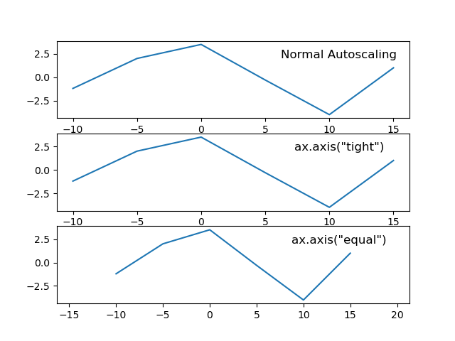
plt.show()ax.axis(…) #
The ax.axis(...) method is a convienent way of controlling the axes limits and enabling/disabling autoscaling.
If you’d like to manually set all of the x/y limits at once, you can use ax.axis for this as well (note that we’re calling it with a single argument that’s a sequence, not 4 individual arguments):
ax.axis([xmin, xmax, ymin, ymax])
However, you’ll probably use axis mostly with either the “tight” or “equal” options. There are other options as well; see the documentation for full details. In a nutshell, though:
- tight: Set axes limits to the exact range of the data
- equal: Set axes scales such that one cm/inch in the y-direction is the same as one cm/inch in the x-direction. In Matplotlib terms, this sets the aspect ratio of the plot to 1. That doesn’t mean that the axes “box” will be square.
And as an example:
fig, axes = plt.subplots(nrows=3)
for ax in axes:
    ax.plot([-10, -5, 0, 5, 10, 15], [-1.2, 2, 3.5, -0.3, -4, 1])

axes[0].set_title('Normal Autoscaling', y=0.7, x=0.8)
axes[1].set_title('ax.axis("tight")', y=0.7, x=0.8)
axes[1].axis('tight')
axes[2].set_title('ax.axis("equal")', y=0.7, x=0.8)
axes[2].axis('equal')
plt.show()
Here is an example of autoscaling.
Manually setting only one limit #
Another trick with limits is to specify only half of a limit. When done after a plot is made, this has the effect of allowing the user to anchor a limit while letting Matplotlib autoscale the rest of it.
# Good -- setting limits after plotting is done
fig, (ax1, ax2) = plt.subplots(1, 2, figsize=plt.figaspect(0.5))
ax1.plot([-10, -5, 0, 5, 10, 15], [-1.2, 2, 3.5, -0.3, -4, 1])
ax2.scatter([-10, -5, 0, 5, 10, 15], [-1.2, 2, 3.5, -0.3, -4, 1])
ax1.set_ylim(bottom=-10)
ax2.set_xlim(right=25)
plt.show()
# Bad -- Setting limits before plotting is done
fig, (ax1, ax2) = plt.subplots(1, 2, figsize=plt.figaspect(0.5))
ax1.set_ylim(bottom=-10)
ax2.set_xlim(right=25)
ax1.plot([-10, -5, 0, 5, 10, 15], [-1.2, 2, 3.5, -0.3, -4, 1])
ax2.scatter([-10, -5, 0, 5, 10, 15], [-1.2, 2, 3.5, -0.3, -4, 1])
plt.show()Scaling axes without modifying your data #
You can scale an axis by a factor (even an order-of-magnitude one) on your matplotlib axes by using the matplotlib.ticker.FuncFormatter class from ticker module.
from matplotlib import ticker
import matplotlib.pyplot as plt
fig, axes = plt.subplots()
...
scale = 1e6  # or any other scaling factor
ticks = ticker.FuncFormatter(lambda x, pos: '{0:g}'.format(x/scale))
axes.yaxis.set_major_formatter(ticks)
The cool feature is that you can customize the ticker.FuncFormatter scaler with a personal function, which in my blog post is a function that uses SI prefixes to scale currency values.
import matplotlib.pyplot as plt
from matplotlib.ticker import FuncFormatter
fig, axes = plt.subplots()

# format the currency
def currency(x, pos):
    # The two args are the value and tick position
    if x >= 1000000:
        return '${:1.1f}M'.format(x*1e-6)
    return '${:1.0f}K'.format(x*1e-3)

formatter = FuncFormatter(currency)
axes.xaxis.set_major_formatter(formatter)
From Formatting Data for Matplotlib Axes – Angelo Varlotta.
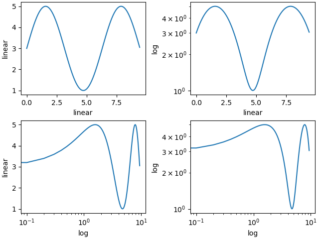
Changing scale on axes #
If you need to plot in linear or logarithmic scale, all you need to do is use the set_xscale ot set_yscale methods, and use either 'linear' or 'log' as arguments.
import matplotlib.pyplot as plt
import numpy as np

fig, axs = plt.subplot_mosaic([['linear', 'linear-log'],
                               ['log-linear', 'log-log']],
                               layout='constrained')

x = np.arange(0, 3*np.pi, 0.1)
y = 2 * np.sin(x) + 3

ax = axs['linear']
ax.plot(x, y)
ax.set_xlabel('linear')
ax.set_ylabel('linear')

ax = axs['linear-log']
ax.plot(x, y)
ax.set_yscale('log')
ax.set_xlabel('linear')
ax.set_ylabel('log')

ax = axs['log-linear']
ax.plot(x, y)
ax.set_xscale('log')
ax.set_xlabel('log')
ax.set_ylabel('linear')

ax = axs['log-log']
ax.plot(x, y)
ax.set_xscale('log')
ax.set_yscale('log')
ax.set_xlabel('log')
ax.set_ylabel('log')
See example below of different scales for the axis (from Axis scales – Matplotlib docs).
Some more formatting examples #
Title, labels and ticks #
#importing and creating figure
from matplotlib import ticker
fig, ax = plt.subplots(figsize=(20,20))

#Add title and set font size
plt.title(‘Title', fontsize=50)

#Add xaxis label & yaxis label, with fontsize
plt.xlabel('xlabel', fontsize=30)
plt.ylabel('ylabel', fontsize=30)

#tick-size and weight [ 'normal' | 'bold' | 'heavy' | 'light' |
#'ultrabold' | 'ultralight']
plt.yticks(fontsize=20, weight='bold')
plt.xticks(fontsize=20, weight='bold')

#Format ticks as currency or any prefix (replace $ with your choice)
ax.xaxis.set_major_formatter(ticker.StrMethodFormatter("${x}"))

#Format ticks as distance or any suffix (replace km with your #choice)
ax.xaxis.set_major_formatter(ticker.StrMethodFormatter("{x} km"))

#Format ticks decimal point, the number preceding f denotes how many # decimal points e.g use .3f for three
ax.xaxis.set_major_formatter(ticker.StrMethodFormatter("{x:.2f}"))

#Add , for large numbers e.g 10000 to 10,000
ax.xaxis.set_major_formatter(ticker.StrMethodFormatter("{x:,}"))

#Format as a percentage
ax.xaxis.set_major_formatter(ticker.PercentFormatter())

#Format thousands e.g 10000 to 10.0K
ax.yaxis.set_major_formatter(ticker.FuncFormatter(lambda x,pos: format(x/1000,'1.1f')+'K'))

#Format Millions e.g 1000000 to 1.0M
ax.yaxis.set_major_formatter(ticker.FuncFormatter(lambda x,pos: format(x/1000000,'1.1f')+'M'))

#Example of combined tick mark, currency with , & 2 decimal #precision
ax.yaxis.set_major_formatter(ticker.StrMethodFormatter("${x:,.2f}"))
Annotations #
#First argument is the text, ha is horizontal alignment, va is
#vertical alignment, xy is coordinates of the pojnt xytext are the
#coordinates of the text (if you want the text to be away from the
#point)
ax.annotate('annotation', ha='center', va='center', xy = (0.5, 0.5), \
            xytext=(0.51, 0.51), fontsize=30)

#Add v-line with xcoord, min & max ranges with y and aesthetic
#properties
plt.vlines(x=0.5, ymin=-0.05, ymax=0.5, ls=':', lw=3, color='darkblue')

#Add h-line with ycoord, min & max ranges with xand aesthetic
#properties
plt.hlines(y=0.5, xmin=-0.05, xmax=0.5, ls=':', lw=3, color='darkblue')

#Optional code for house keeping
plt.xticks(fontsize=25, weight='bold')
plt.yticks(fontsize=25, weight='bold')
plt.xlim(0,1)
plt.ylim(0,1)
plt.title('Example of Annotation', fontsize=35)
Sizing, limits, and legends #
# load matplotlib pyplot module
import matplotlib.pyplot as plt
import numpy as np
# Change figure size by adjusting figsize parameter
fig, ax = plt.subplots(figsize=(10, 8))# annotation, v-lines & h-lines as explained above
ax.annotate('Blue', ha='center', va='center', xy = (0.5, 0.5), xytext=(0.50, 0.53), fontsize=20, color='darkblue')
plt.vlines(x=0.5, ymin=-0.05, ymax=0.5, ls=':', lw=3, color='darkblue')
plt.hlines(y=0.5, xmin=-0.05, xmax=0.5, ls=':', lw=3, color='darkblue')# scatter plot of one point, label parameter goes in legend
# you can add '_no_legend_' to hide this label in the legend
ax.scatter(x=0.5, y=0.5, label='Blue point')# annotation, v-lines & h-lines as explained above
ax.annotate('Red', ha='center', va='center', xy = (0.75, 0.75), xytext=(0.75, 0.78), fontsize=20, color='darkred')
ax.vlines(x=0.75, ymin=-0.05, ymax=0.75, ls=':', lw=3, color='darkred')
ax.hlines(y=0.75, xmin=-0.05, xmax=0.75, ls=':', lw=3, color='darkred')# scatter plot of one point, label parameter goes in legend
ax.scatter(x=0.75, y=0.75, label='Red point')# house keeping for xticks & yticks explained above
plt.xticks(fontsize=15, weight='bold')
plt.yticks(fontsize=15, weight='bold')# rotate major x axis labels
plt.setp(ax.get_xmajorticklabels(), rotation=90)# rotate all tick labels by 45 degrees and right align
plt.setp(ax.get_xticklabels(), rotation=45, ha='right')# xlim specifies xaxis limits , first argument min limit & second
#argument max limit
ax.set_xlim(0, 1)# ylim specifies yaxis limits , first argument min limit & second
#argument max limit
ax.set_ylim(0, 1)# loc parameter tells location explained below
# prop tells legend font properties, read more below
# markerscale tells how much big should the markers on the legend be
# in proportion to actual markers. 2 implies twice as big
ax.legend(loc=1, prop={'size': 15}, markerscale=2)
ax.set_title('Example of Sizing', fontsize=20)
plt.savefig('example-of-sizing.png')Font properties in the legend are managed by the matplotlib.font_manager.FontProperties class, which is a matplotlib module for finding, managing and using fonts across platforms. Here is the output from the code.
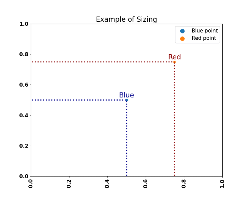
From Make Your Matplotlib Plots Stand Out Using This Cheat Sheet – Towards AI.
How to specify a legend position #
In classic mode, legends will go in the upper right corner by default (you can control this with the loc kwarg). As of v2.0, by default Matplotlib will choose a location to avoid overlapping plot elements as much as possible. To force this option, you can pass in:
ax.legend(loc="best")Also, if you happen to be plotting something that you do not want to appear in the legend, just set the label to “nolegend”.
fig, ax = plt.subplots(1, 1)
ax.bar([1, 2, 3, 4], [10, 20, 25, 30], label="Foobar", align='center', color='lightblue')
ax.plot([1, 2, 3, 4], [10, 20, 25, 30], label="_nolegend_", marker='o', color='darkred')
ax.legend(loc='best')
plt.show()
If you wish to position the legend in a specific point of the plot, you need to use the combination loc in the legend object and the box_to_anchor method.
The loc parameter specifies in which corner of the bounding box the legend is placed. The default for loc is loc="best" which gives unpredictable results when the bbox_to_anchor argument is used.
Therefore, when specifying bbox_to_anchor, always specify loc as well.
The default for bbox_to_anchor is (0,0,1,1), which is a bounding box over the complete axes. If a different bounding box is specified, is is usually sufficient to use the first two values, which give (x0, y0) of the bounding box.
import matplotlib.pyplot as plt
plt.rcParams["figure.figsize"] = 6, 3
fig, axes = plt.subplots(ncols=3)
locs = ["upper left", "lower left", "center right"]
for l, ax in zip(locs, axes.flatten()):
    ax.set_title(l)
    ax.plot([1,2,3],[2,3,1], "b-", label="blue")
    ax.plot([1,2,3],[1,2,1], "r-", label="red")
    ax.legend(loc=l, bbox_to_anchor=(0.6,0.5))
    ax.scatter((0.6),(0.5), s=81, c="limegreen", transform=ax.transAxes)

plt.tight_layout()
plt.show()
The previous code produces the following image with the different positions of the legend.
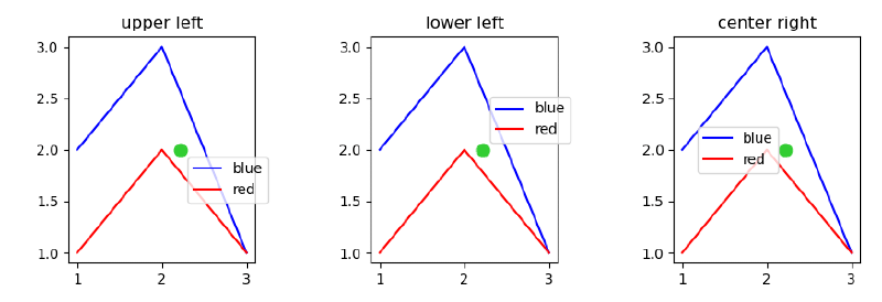
From How to specify legend position in Matplotlib in graph coordinates – Stack Overflow. For the transform=ax.transAxes code, see Transformations Tutorial – Matplotlib Documentation.
Dealing with the boundaries, layout, ticks, spines, etc #
Let’s talk about the annotation on the outside of the axes, the borders of the axes, and how to adjust the amount of space around the axes.
Ticks, tick lines, tick labels and tickers #
This is a constant source of confusion:
- A Tick is the location of a Tick Label.
- A Tick Line is the line that denotes the location of the tick.
- A Tick Label is the text that is displayed at that tick.
- A Ticker automatically determines the ticks for an Axis and formats the tick labels.
tick_params() is often used to help configure your tickers.
fig, ax = plt.subplots()
ax.plot([1, 2, 3, 4], [10, 20, 25, 30])
# Manually set ticks and tick labels on the x-axis (note ax.xaxis.set, not ax.set!)
ax.xaxis.set(ticks=range(1, 5), ticklabels=[3, 100, -12, "foo"]) # Make the y-ticks a bit longer and go both in and out...
ax.tick_params(axis='y', direction='inout', length=10)
plt.show()A commonly-asked question is “How do I plot non-numerical categories?” Currently, the easiest way to do this is to “fake” the x-values and then change the tick labels to reflect the category. For example:
data = [('apples', 2), ('oranges', 3), ('peaches', 1)]
fruit, value = zip(*data)
fig, ax = plt.subplots()
x = np.arange(len(fruit))
ax.bar(x, value, align='center', color='gray')
ax.set(xticks=x, xticklabels=fruit)
plt.show()
Matplotlib stylesheets #
You can load a Matplotlib stylesheet using the command below. Here I’m using an example of a stylesheet for box plots.
import matplotlib.pyplot as plt
plt.style.use('boxplot-style.mplstyle')
Within the stylesheet you’ll have settings such as this example to add change the padding for the y-axis ticks.
ytick.major.pad: 5In case you wish to override the stylesheet setting, you can use the following Matplotlib code to modify the padding for the y-axis ticks.
import matplotlib.pyplot as plt
fig, ax = plt.subplots()
ax.tick_params(axis='y', which='major', pad=5)
Subplot spacing #
The spacing between the subplots can be adjusted using fig.subplots_adjust(). Play around with the example below to see how the different arguments affect the spacing.
fig, axes = plt.subplots(2, 2, figsize=(9, 9))
fig.subplots_adjust(wspace=0.5, hspace=0.3,
                    left=0.125, right=0.9,
                    top=0.9,    bottom=0.1)
plt.show()
The “Tight Layout” feature, when invoked with fig.tight_layout, will attempt to resize margins and subplots so that there are no overlapping titles/axis labels/etc.:
def example_plot(ax):
    ax.plot([1, 2])
    ax.set_xlabel('x-label', fontsize=16)
    ax.set_ylabel('y-label', fontsize=8)
    ax.set_title('Title', fontsize=24)

fig, ((ax1, ax2), (ax3, ax4)) = plt.subplots(nrows=2, ncols=2)
example_plot(ax1)
example_plot(ax2)
example_plot(ax3)
example_plot(ax4)

# Enable fig.tight_layout to compare...
#fig.tight_layout()

plt.show()
Tables within plots #
You may insert a table in your plot using the matplotlib.pyplot.table method with data from a Pandas dataframe.
ax = df.plot(colormap='Dark2', figsize=(14, 7))
df_summary = df.describe()
# Specify values of cells in the table
ax.table(cellText=df_summary.values,
         # Specify width of the table
         colWidths=[0.3]*len(df.columns),
         # Specify row labels
         rowLabels=df_summary.index,
         # Specify column labels
         colLabels=df_summary.columns,
         # Specify location of the table
         loc='top')
plt.show()
GridSpec #
Under the hood, Matplotlib utilizes GridSpec to lay out the subplots. While plt.subplots() is fine for simple cases, sometimes you will need more advanced subplot layouts. In such cases, you should use GridSpec directly. GridSpec is outside the scope of this tutorial, but it is handy to know that it exists. GridSpec - matplotlib is a guide on how to use it.
Sharing axes #
Sharing an axis means that the axis in one or more subplots will be tied together such that any change in one of the axis changes all of the other shared axes. When interacting with the plots, all of the shared axes will pan and zoom automatically.
fig, (ax1, ax2) = plt.subplots(1, 2, sharex=True, sharey=True)
ax1.plot([1, 2, 3, 4], [1, 2, 3, 4])
ax2.plot([3, 4, 5, 6], [6, 5, 4, 3])
plt.show()
“Twinning” axes #
Sometimes one may want to overlay two plots on the same axes, but the scales may be entirely different. You can simply treat them as separate plots, but then “twin” them.
fig, ax1 = plt.subplots(1, 1)
ax1.plot([1, 2, 3, 4], [1, 2, 3, 4])
# Twin ax1 as ax2
ax2 = ax1.twinx()
ax2.scatter([1, 2, 3, 4], [60, 50, 40, 30])
ax1.set(xlabel='X', ylabel='First scale')
ax2.set(ylabel='Other scale')
plt.show()Axis spines #
Spines are the axis lines for a plot. Each plot can have four spines: “top”, “bottom”, “left” and “right”. By default, they are set so that they frame the plot, but they can be individually positioned and configured via the set_position() method of the spine. Here are some different configurations.
fig, ax = plt.subplots()
ax.plot([-2, 2, 3, 4], [-10, 20, 25, 5])
ax.spines['top'].set_visible(False)
ax.xaxis.set_ticks_position('bottom')  # no ticklines at the top
ax.spines['right'].set_visible(False)
ax.yaxis.set_ticks_position('left')  # no ticklines on the right
# "outward"
# Move the two remaining spines "out" away from the plot by 10 points
ax.spines['bottom'].set_position(('outward', 10))
ax.spines['left'].set_position(('outward', 10))# "data"
# Have the spines stay intersected at (0,0)
ax.spines['bottom'].set_position(('data', 0))
ax.spines['left'].set_position(('data', 0))# "axes"
# Have the two remaining spines placed at a fraction of the axes
ax.spines['bottom'].set_position(('axes', 0.75))
ax.spines['left'].set_position(('axes', 0.3))
plt.show()Artists #
The original Jupyter Notebook is here: Part 5 - Artists.
Anything that can be displayed in a Figure is an Artist. There are two main classes of Artists: primatives and containers. Containers are objects like Figure and Axes. Several examples of standard Matplotlib graphics primitives (artists) are drawn using the Matplotlib API. A full list of artists and the documentation is available at Artist API - matplotlib.
Collections #
In addition to the Figure and Axes containers, there is another special type of container called a Collection. A Collection usually contains a list of primitives of the same kind that should all be treated similiarly.
MPL toolkits #
In addition to the core library of Matplotlib, there are a few additional utilities that are set apart from Matplotlib proper for some reason or another, but are often shipped with Matplotlib.
- Basemap - shipped separately from Matplotlib due to size of mapping data that are included.
- mplot3d - shipped with - to provide very simple, rudimentary 3D plots in the same style as matplotlib’s 2D plots.
- axes_grid1 - An enhanced SubplotAxes. Very Enhanced…
The original Jupyter Notebook is here: Part 6 - MPL Toolkits.
mplot3d #
By taking advantage of Matplotlib’s z-order layering engine, mplot3d emulates 3D plotting by projecting 3D data into 2D space, layer by layer. Its goal is to allow for Matplotlib users to produce 3D plots with the same amount of simplicity as 2D plots.
from mpl_toolkits.mplot3d import Axes3D, axes3d

fig, ax = plt.subplots(1, 1, subplot_kw={'projection': '3d'})
X, Y, Z = axes3d.get_test_data(0.05)
ax.plot_wireframe(X, Y, Z, rstride=10, cstride=10)

plt.show()
axes_grid1 #
This module was originally intended as a collection of helper classes to ease the displaying of (possibly multiple) images. Some of the functionality has come to be useful for non-image plotting as well. Some classes deals with the sizing and positioning of multiple Axes relative to each other (ImageGrid, RGBAxes, and AxesDivider). The ParasiteAxes allow for the plotting of multiple datasets in the same axes, but with each their own x or y scale. Also, there is the AnchoredArtist that can be used to anchor particular artist objects in place.
One can get a sense of this toolkit by browsing through its user guide at Overview of AxesGrid toolkit. There is one particular feature that is an absolute must-have for me — automatic allocation of space for colorbars.
from mpl_toolkits.axes_grid1 import AxesGrid
fig = plt.figure()
grid = AxesGrid(fig, 111, # similar to subplot(111)
                nrows_ncols = (2, 2),
                axes_pad = 0.2,
                share_all=True,
                label_mode = "L",  # similar to "label_outer"
                cbar_location = "right",
                cbar_mode="single",
               )

extent = (-3,4,-4,3)
for i in range(4):
    im = grid[i].imshow(Z, extent=extent, interpolation="nearest")

grid.cbar_axes[0].colorbar(im)
plt.show()
Extras #
A good, in-depth guide for using Matplotlib is given by the tutorials. These are broken up into Introductory topics, Intermediate topics and Advanced topics, as well as sections covering specific topics.
For shorter examples, see the examples page. You can also find external resources and a FAQ in the user guide.
Visualization advice #