When I generate new Matplotlib plots I always spend a lot of time to make them attractive, especially for what concern the finer details, but unfortunately this takes a lot of time because I need to recall from memory the specific code. The right way to do this would be to save these details in an appropriate file and refer to them when needed. Matplotlib helps you in this regard with stylesheets, and there are already several, default stylesheets that can easily satisfy the needs of many people. However, I wanted a stylesheet that was more personal, closer to the qualitative color palette that I’ve been using for some time now, and consistent among the plots of my posts and projects. After reading an article on the effectiveness of Matplotlib stylesheets, I decided to bite the bullet and create my own personalized stylesheets for scatter, line, bar and box plots.
The code for all of the stylesheets that I created are very similar to one another, with the exception for the box plot stylesheet which had a lot of personal settings that I wanted to preserve for future box plots. The default configuration settings for Matplotlib plots can be retrieved with the following code, which will produce an extremely long list of settings.
>>> import matplotlib as mpl
>>> mpl.rcParams.keys()
These settings can also be found in the matplotlibrc file. This and more information about customizing the properties and default styles of Matplotlib can be obtained directly from the Matplotlib documentation.
Scatter plot #
In the case of the stylesheet for a scatter plot, I made the following plot using data from the 2019 Global Burden of Disease Study Results and the World Bank and OECD National Accounts.
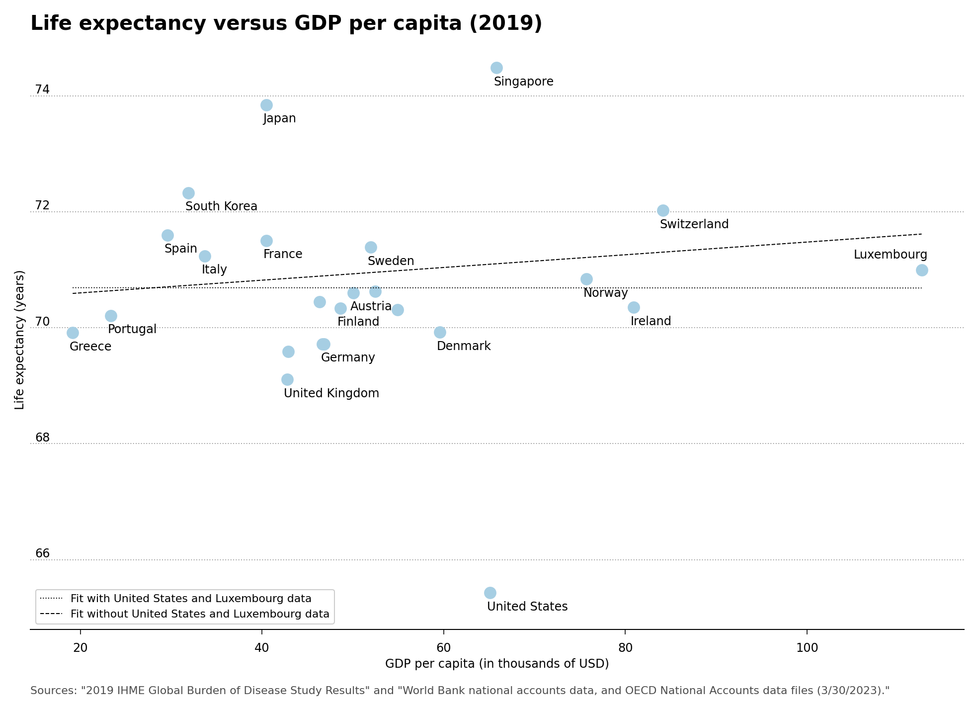
Plot 1 – Life Expectancy versus GDP per capita in US dollars
The color palette that I use is saved in the axes.prop_cycle option at the beginning of the stylesheet code. I decided to stick with a modified Paired qualitative Matplotlib color palette, using a darker shade of yellow rather than the default yellow which seemed too pale for me, and would be harder to see on a white background. This custom color palette is present in all of my Matplotlib stylesheets. The Matplotlib stylesheet code for the scatter plot is shown below.
# Set custom colors. All colors are in web style hex format.
axes.prop_cycle: cycler('color', ['A6CEE3', '1F78B4', 'B2DF8A', '33A02C', 'FB9A99', 'E31A1C', 'FDBF6F', 'FF7F00', 'CAB2D6', '6A3D9A', 'FFD700', 'B15928'])

# Style spines
axes.linewidth: 1               # Spine edge line width
axes.spines.top: False          # Display axis spines (True or False)
axes.spines.left: False         # We only want the bottom spines
axes.spines.right: False
axes.spines.bottom: True

# Grid style
axes.grid: true                 # display grid or not
axes.grid.axis: y               # which axis the grid should apply to
grid.linewidth: 1               # in points
grid.linestyle: :               # grid linestyle
grid.color: A5A5A5              # grid color
axes.axisbelow: True            # Sets axis gridlines below lines and patches.

# Move tick labels to left side
ytick.labelleft: True           # draw tick labels on the left side
ytick.labelright: False         # draw tick labels on the right side
ytick.alignment: bottom         # alignment of yticks

# Setting font sizes and spacing
axes.labelsize: 12              # font size of the x and y labels
xtick.labelsize: 12             # font size of the x tick labels
ytick.labelsize: 12             # font size of the y tick labels
font.size: 12                   # default font size for text, given in points.
xtick.major.pad: 8              # distance to major tick label in points
ytick.major.pad: -20            # distance to major tick label in points

# Remove major and minor ticks except for on the x-axis.
xtick.major.size: 5             # major tick size in points
xtick.minor.size: 0             # minor tick size in points
ytick.major.size: 0
ytick.minor.size: 0

# Title styling
axes.titlelocation: left        # alignment of the title: {left, right, center}
axes.titlepad: 20               # pad between axes and title in points
axes.titlesize: 20              # font size of the axes title
axes.titleweight: bold          # font weight of title

# Set spacing for figure and also DPI.
figure.subplot.left: 0.08       # the left side of the subplots of the figure
figure.subplot.right: 0.95      # the right side of the subplots of the figure
figure.subplot.bottom: 0.07     # the bottom of the subplots of the figure
figure.figsize: 15, 10          # figure size in inches
figure.dpi: 150                 # figure dots per inch

# Properties for saving the figure. Ensure a high DPI when saving so we have a good resolution.
savefig.dpi:       144          # figure dots per inch or 'figure'
savefig.facecolor: white        # figure face color when saving
savefig.bbox:      tight        # {tight, standard}
savefig.pad_inches:   0.2       # padding when bbox is set to tight

# Legend Styling
legend.framealpha: 1
In order to make use of the stylesheet, you need to add the following code for the plot. The stylesheet code shown above is contained in the barplot-style.mplstyle file.
import matplotlib.pyplot as plt
plt.style.use('barplot-style.mplstyle')
Line plot #
In the same vein as the scatter plot, I made a stylesheet for line plots using data from the 2019 Global Burden of Disease Study Results. This plot makes use of almost all of the colors in the color palette. The plot with the stylesheet is shown below.
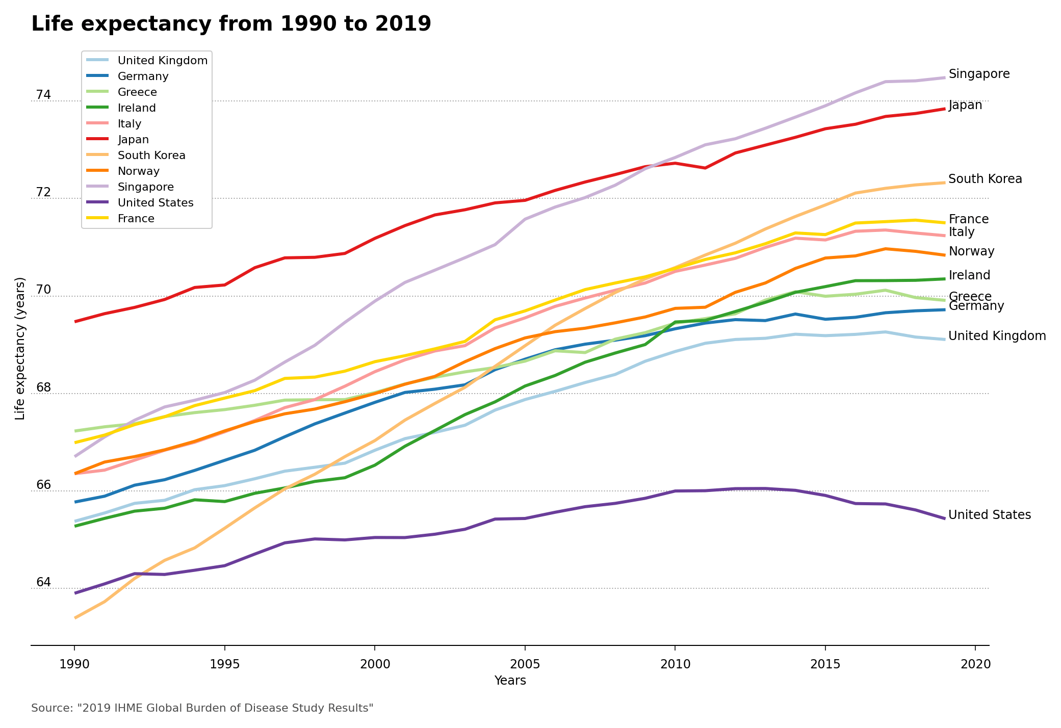
Plot 2 – Life Expectancy from 1990 to 2019
The code for the Matplotlib stylesheet for the line plot is shown here.
# Set custom colors. All colors are in web style hex format.
axes.prop_cycle: cycler('color', ['A6CEE3', '1F78B4', 'B2DF8A', '33A02C', 'FB9A99', 'E31A1C', 'FDBF6F', 'FF7F00', 'CAB2D6', '6A3D9A', 'FFD700', 'B15928'])

# Style spines
axes.linewidth: 1               # Spine edge line width
axes.spines.top: False          # Display axis spines (True or False)
axes.spines.left: False         # We only want the bottom spines
axes.spines.right: False
axes.spines.bottom: True

# Set line styling for line plots
lines.linewidth: 3              # line width in points
lines.solid_capstyle: butt      # Makes a square ending of the line stopping at datapoint

# Grid style
axes.grid: true                 # display grid or not
axes.grid.axis: y               # which axis the grid should apply to
grid.linewidth: 1               # in points
grid.linestyle: :               # grid linestyle
grid.color: A5A5A5              # grid color
axes.axisbelow: True            # Sets axis gridlines below lines and patches.

# Move tick labels to left side
ytick.labelleft: True           # draw tick labels on the left side
ytick.labelright: False         # draw tick labels on the right side
ytick.alignment: bottom         # alignment of yticks

# Setting font sizes and spacing
axes.labelsize: 12              # font size of the x and y labels
xtick.labelsize: 12             # font size of the x tick labels
ytick.labelsize: 12             # font size of the y tick labels
font.size: 12                   # default font size for text, given in points.
xtick.major.pad: 8              # distance to major tick label in points
ytick.major.pad: -20            # distance to major tick label in points

# Remove major and minor ticks except for on the x-axis.
xtick.major.size: 5             # major tick size in points
xtick.minor.size: 0             # minor tick size in points
ytick.major.size: 0
ytick.minor.size: 0

# Title styling
axes.titlelocation: left        # alignment of the title: {left, right, center}
axes.titlepad: 20               # pad between axes and title in points
axes.titlesize: 20              # font size of the axes title
axes.titleweight: bold          # font weight of title

# Set spacing for figure and also DPI.
figure.subplot.left: 0.08       # the left side of the subplots of the figure
figure.subplot.right: 0.95      # the right side of the subplots of the figure
figure.subplot.bottom: 0.07     # the bottom of the subplots of the figure
figure.figsize: 15, 10          # figure size in inches
figure.dpi: 150                 # figure dots per inch

# Properties for saving the figure. Ensure a high DPI when saving so we have a good resolution.
savefig.dpi:       144          # figure dots per inch or 'figure'
savefig.facecolor: white        # figure face color when saving
savefig.bbox:      tight        # {tight, standard}
savefig.pad_inches:   0.2       # padding when bbox is set to tight

# Legend Styling
legend.framealpha: 1
Bar plot #
Using NHS Digital data from the Health Survey for England 2021 report on Overweight and obesity in adults and my custom stylesheet, I made the following bar plot.
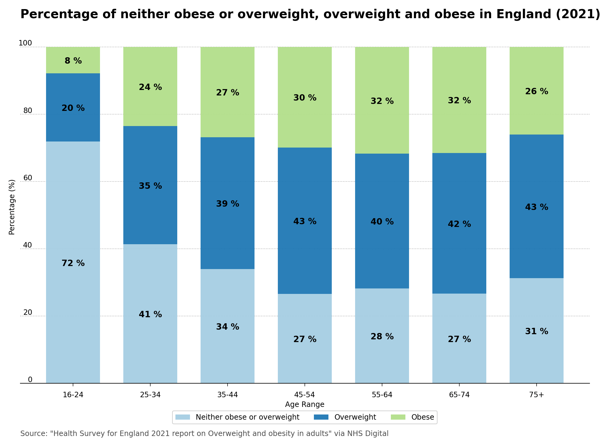
Plot 3 – Percentage of neither obese or overweight, overweight and obese in England (2021)
You can have a view of the Matplotlib bar plot stylesheet here.
# Set custom colors. All colors are in web style hex format.
axes.prop_cycle: cycler('color', ['A6CEE3', '1F78B4', 'B2DF8A', '33A02C', 'FB9A99', 'E31A1C', 'FDBF6F', 'FF7F00', 'CAB2D6', '6A3D9A', 'FFD700', 'B15928'])

# Style spines
axes.linewidth: 1               # Spine edge line width
axes.spines.top: False          # Display axis spines (True or False)
axes.spines.left: False         # We only want the bottom spines
axes.spines.right: False
axes.spines.bottom: True

# Grid style
axes.grid: true                 # display grid or not
axes.grid.axis: y               # which axis the grid should apply to
grid.linewidth: 1               # in points
grid.linestyle: :               # grid linestyle
grid.color: A5A5A5              # grid color
axes.axisbelow: True            # Sets axis gridlines below lines and patches.

# Move tick labels to left side
ytick.labelleft: True           # draw tick labels on the left side
ytick.labelright: False         # draw tick labels on the right side
ytick.alignment: bottom         # alignment of yticks

# Setting font sizes and spacing
axes.labelsize: 12              # font size of the x and y labels
xtick.labelsize: 12             # font size of the x tick labels
ytick.labelsize: 12             # font size of the y tick labels
font.size: 12                   # default font size for text, given in points.
xtick.major.pad: 8              # distance to major tick label in points
ytick.major.pad: -20            # distance to major tick label in points

# Remove major and minor ticks except for on the x-axis.
xtick.major.size: 5             # major tick size in points
xtick.minor.size: 0             # minor tick size in points
ytick.major.size: 0
ytick.minor.size: 0

# Title styling
axes.titlelocation: left        # alignment of the title: {left, right, center}
axes.titlepad: 20               # pad between axes and title in points
axes.titlesize: 20              # font size of the axes title
axes.titleweight: bold          # font weight of title

# Set spacing for figure and also DPI.
figure.subplot.left: 0.08       # the left side of the subplots of the figure
figure.subplot.right: 0.95      # the right side of the subplots of the figure
figure.subplot.bottom: 0.07     # the bottom of the subplots of the figure
figure.figsize: 15, 10          # figure size in inches
figure.dpi: 150                 # figure dots per inch

# Properties for saving the figure. Ensure a high DPI when saving so we have a good resolution.
savefig.dpi:       144          # figure dots per inch or 'figure'
savefig.facecolor: white        # figure face color when saving
savefig.bbox:      tight        # {tight, standard}
savefig.pad_inches:   0.2       # padding when bbox is set to tight

# Legend Styling
legend.framealpha: 1
Box plot #
And finally, using data from the National Tutoring Programme for the 2022/23 Academic year, from the UK Department for Education (DfE), I made the following box plot with my custom stylesheet.
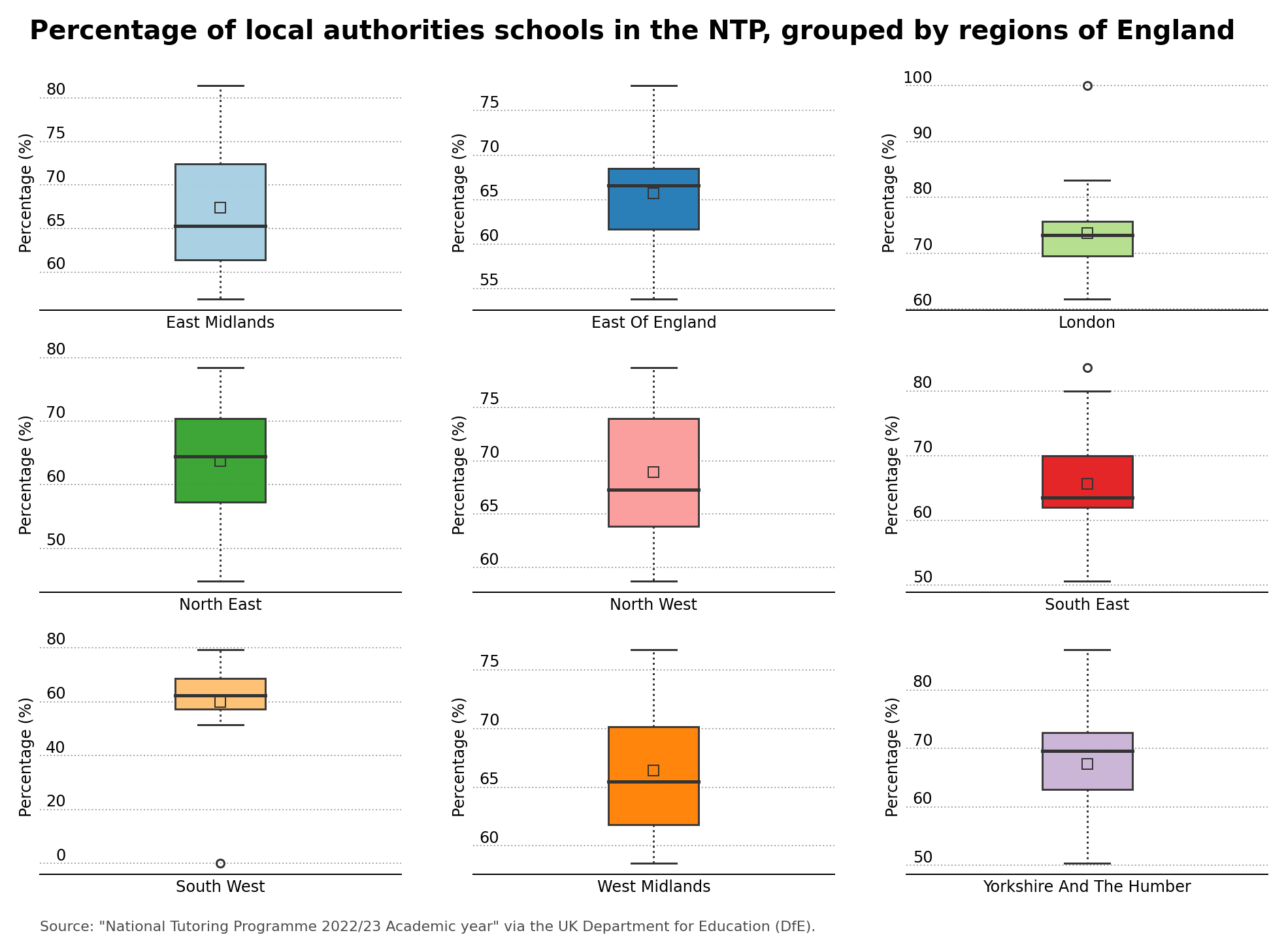
Plot 4 – Percentage of local authorities schools in the NTP, grouped by regions of England
For box plots, I decided to show the median, represented by the horizontal solid line in each box plot, and the mean which is shown by the square in the box plot. The code for the Matplotlib stylesheet for the box plot is displayed below.
# Set custom colors. All colors are in web style hex format.
axes.prop_cycle: cycler('color', ['A6CEE3', '1F78B4', 'B2DF8A', '33A02C', 'FB9A99', 'E31A1C', 'FDBF6F', 'FF7F00', 'CAB2D6', '6A3D9A', 'FFD700', 'B15928'],)

# Style spines
axes.linewidth: 1               # Spine edge line width
axes.spines.top: False          # Display axis spines (True or False)
axes.spines.left: False         # We only want the bottom spines
axes.spines.right: False
axes.spines.bottom: True

# Box plot styles
boxplot.boxprops.linewidth: 1.5       # boxplot edge line width
boxplot.capprops.color: 0.2
boxplot.capprops.linewidth: 1.5
boxplot.flierprops.markeredgecolor: 0.2
boxplot.flierprops.markeredgewidth: 1.5
boxplot.showmeans: True
boxplot.meanprops.color: 0.2
boxplot.meanprops.linewidth: 1.5
boxplot.meanprops.marker: s
boxplot.meanprops.markeredgecolor: 0.2
boxplot.meanprops.markerfacecolor: none
boxplot.meanprops.markersize: 8.0
boxplot.medianprops.linewidth: 2.5    # boxplot median line width
boxplot.medianprops.color: 0.2
boxplot.whiskerprops.linestyle: :
boxplot.whiskerprops.linewidth: 1.5
boxplot.whiskerprops.color: 0.2

# Grid style
axes.grid: true                 # display grid or not
axes.grid.axis: y               # which axis the grid should apply to
grid.linewidth: 1               # in points
grid.linestyle: :               # grid linestyle
grid.color: A5A5A5              # grid color
axes.axisbelow: True            # Sets axis gridlines below lines and patches.

# Move tick labels to left side
ytick.labelleft: True           # draw tick labels on the left side
ytick.labelright: False         # draw tick labels on the right side
ytick.alignment: bottom         # alignment of yticks

# Setting font sizes and spacing
axes.labelsize: 12              # font size of the x and y labels
xtick.labelsize: 12             # font size of the x tick labels
ytick.labelsize: 12             # font size of the y tick labels
font.size: 12                   # default font size for text, given in points.
xtick.major.pad: 8              # distance to major tick label in points
ytick.major.pad: -20            # distance to major tick label in points

# Remove major and minor ticks except for on the x-axis.
xtick.major.size: 5             # major tick size in points
xtick.minor.size: 0             # minor tick size in points
ytick.major.size: 0
ytick.minor.size: 0

# Title styling
axes.titlelocation: left        # alignment of the title: {left, right, center}
axes.titlepad: 20               # pad between axes and title in points
axes.titlesize: 28              # font size of the axes title
axes.titleweight: bold          # font weight of title

# Set spacing for figure and also DPI.
figure.subplot.left: 0.08       # the left side of the subplots of the figure
figure.subplot.right: 0.95      # the right side of the subplots of the figure
figure.subplot.bottom: 0.07     # the bottom of the subplots of the figure
figure.figsize: 15, 10          # figure size in inches
figure.dpi: 150                 # figure dots per inch

# Properties for saving the figure. Ensure a high DPI when saving so we have a good resolution.
savefig.dpi:       144          # figure dots per inch or 'figure'
savefig.facecolor: white        # figure face color when saving
savefig.bbox:      tight        # {tight, standard}
savefig.pad_inches:   0.2       # padding when bbox is set to tight

# Legend Styling
legend.framealpha: 1
As you can see, the style for the axes, grid, titles, labels, font sizes and colors are consistent from plot to plot. You can see the code for the scatter and line plots, bar plot and box plot on my GitHub repository.