
Summary #
Unplanned readmissions are the most useful key metric when evaluating the quality of care of a hospital, as it highlights the practitioners’ diagnosis or treatment error. Unplanned readmissions are those that occur within 30 days of discharge from the last hospital visit, and are more closely correlated to health care administration. Consequently, decreasing unplanned readmissions are a direct measure of the improvement of patients’ health as well as being of great financial relief to health care centers. Therefore, the primary focus of this data analysis is to generate a predictive model that can forecast the agents that may be responsible for unplanned hospital readmissions.
Introduction #
Diabetes is quickly becoming one of the major causes of mortality in the developing world, due to changing lifestyles and massive urbanization of the population, and is currently affecting over 10% of the US population alone according to the CDC. Moreover, recent studies predict over 1.3 billion people worldwide will have diabetes by the year 2050. Millions of deaths could be prevented each year by use of better analytics, such as non-invasive screening, tailor-made solutions and hospital readmissions.
The data set employed in this analysis is the Diabetes 130-US hospitals for years 1999-2008 data set from the UCI Machine Learning Repository web site, which represents 10 years of clinical care at 130 US hospitals and integrated delivery networks. It includes 101766 entries and 50 features representing patient and hospital outcomes. The data contain such attributes as patient number, race, gender, age, admission type, time in hospital, medical specialty of the admitting physician, number of lab tests performed, glycated hemoglobin (HbA1c) test results, diagnosis, number of medications, diabetic medications, number of outpatient, inpatient, and emergency visits in the year before the hospitalization.
Exploratory data analysis #
To get a better feel for the data set, a few exploratory data analysis plots are displayed below. The three plots in Figure 1 highlight the percentage of null values in the data set, the percent breakdown for the medical specialty of the admitting primary physician and the percent breakdown for payer codes. As a consequence of the high prevalence of null values in the weight, medical_specialty and payer_code features, these are dropped from further analysis.
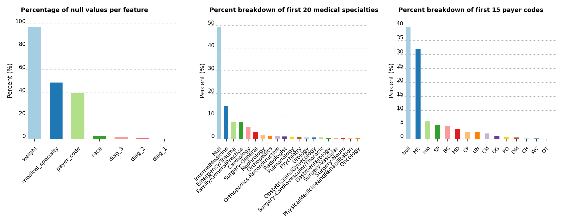
Figure 1 – Percentage of null values in the data set, of feature composition for the medical specialty of the primary physician and of the percent breakdown for payer codes
As shown below (Figure 2, left), the analysis exposes a higher predominance of elder patients above the age of 40 in the data set. Moreover, the middle plot shows that the majority of patients are of Caucasian origins, while the last plot displays a slightly greater presence of female over male patients.
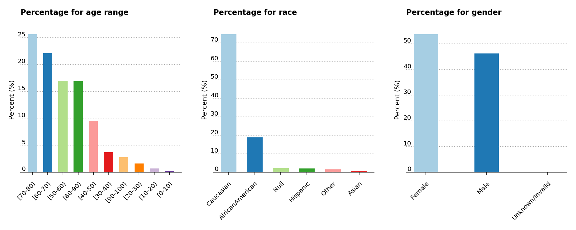
Figure 2 – Percentage presence for age, race and gender
The primary research article used for this analysis suggests that the probability of readmission is contingent on the glycated hemoglobin, orHbA1c, measurement in the primary diagnosis (Figure 3, left), so both the HbA1c measurement and the primary diagnosis features are retained in the data analysis, even though theHbA1c measurement was only performed in less than 17% of the inpatient cases. The article also suggests that the primary physicians’ diagnosis may be responsible for the patients’ probablitiy of readmission, so the percentages of patients by primary physicians’ diagnosis is displayed (Figure 3, center). Readmission cases are defined as those occurring less than 30 days from the prior diagnosis, and represent a small amount of cases for hospital readmissions (just above 11% of all cases) compared to non-readmission and >30 days cases (Figure 3, right).
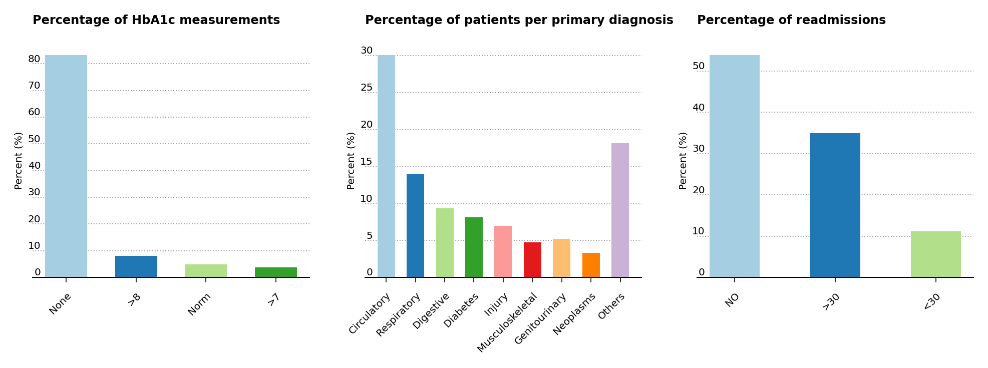
Figure 3 – Percentage presence for HbA1c, primary patient diagnosis and cases for readmission
Correlation plot #
A correlation plot with the numerical features is plotted in Figure 4. Without much surprise, one can notice that num_medications is moderately correlated with time_in_hospital and num_of_procedures. However, no other correlation can be gathered from the plot.
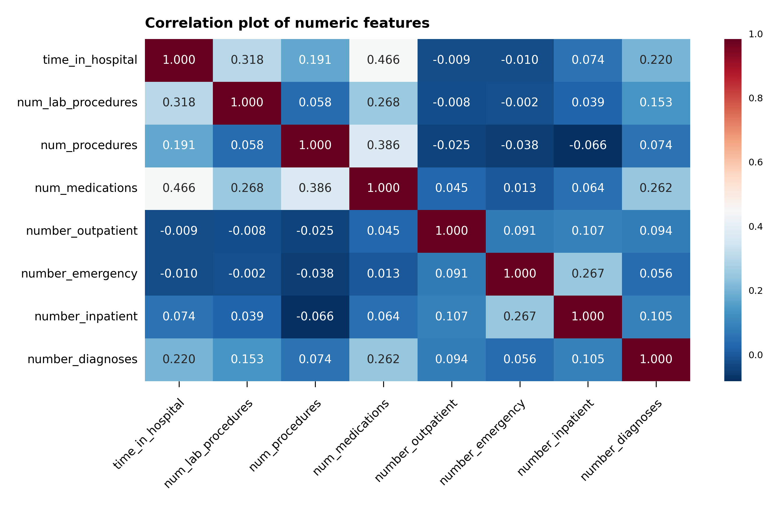
Figure 4 – Correlation plot of the numeric features
Data Preparation and Feature Engineering #
A summary of the data preparation and feature engineering that are performed in the analysis are compiled in the bullet list below:
- All of the
objectvalues in the data frame are converted tostringvalues, - All null values from the
racecategory and theUnknown/Invalidsubcategory are removed from theGendercategory, - As already mentioned,
weight,medical_specialtyandpayer_codecolumns are removed due to the large presence of null values, encounter_idcolumn is removed since it isn’t relevant to the analysis,- Null, not admitted and not mapped values are removed from
admission_type_id, - All variations of
Expired at...orExpiredindischarge_disposition_idare removed since they won’t be responsible for further readmission cases. Null, not admitted and unknown/invalid values indischarge_disposition_idare removed as well, - Null, not available, not mapped and unknown/invalid values are removed from
admission_source_id, - Following the analysis conditions laid out in the main research article for this work, duplicate patient data are removed to maintain the statistical independence of the data, after which the
patient_nbrcolumn is dropped, citogliptonandexamideare removed since they don’t offer any discriminatory information,glimepiride-pioglitazoneandmetformin-rosiglitazoneare removed as well due to the lack of discriminatory information,number_outpatient,number_emergencyandnumber_inpatientare summed into one column calledservice_useand then removed,- The primary
diag_1values are encoded into nine major groups:circulatory,respiratory,digestive,diabetes,injury,musculoskeletal,genitourinary,neoplasmsandothers, - The secondary
diag_2and additionaldiag_3are removed to simplify the data analysis, readmittedcolumn is divided into two0and1categories, where the0category contains theNot readmittedand the> 30 dayscases, and the1category consists of the< 30 dayscases,- Categorical variables are encoded for all columns except for the six numerical columns:
time_in_hospital,num_lab_procedures,num_procedures,num_medications,number_diagnosesandservice_use.
Dealing with unbalanced data #
The data set is unbalanced for what concerns readmission to non-readmission and >30 days cases, due to the small amount of cases for hospital readmissions (just above 11% of all cases). To make up for this lack of readmission cases, the majority data set has been undersampled and made to be equal to the minority data set. This is accomplished with the imbalanced-learn package which is part of the scikit-learn-contrib project. More about imbalanced-learn can be found at scikit-learn-contrib/imbalanced-learn. To generate a balanced data set, the RandomUnderSampler class has been employed.
Standardization of the data #
The numeric features have been standardized for each feature, by subtracting the mean of the feature and dividing by its standard deviation, using Scikit-Learn’s StandardScaler class. Let’s now proceed with the modeling of the data.
Data modeling #
For the sake of interpretation, the data modeling makes use of three, simple classification algorithms, all of which are available in Scikit-Learn: Support Vector Classifier (SVC), AdaBoost Classifier and Gradient Boosting Classifier. For each of these algorithms in Table 1, the analysis calculates the balanced accuracy, precision, recall, F-score and cross-validated mean Brier score for readmitted cases.
| Balanced accuracy | Precision | Recall | F-score | Mean Brier score | |
|---|---|---|---|---|---|
| Gradient boosting | 0.6003 | 0.1328 | 0.5464 | 0.2137 | 0.2372 ± 0.0021 |
| AdaBoost | 0.5893 | 0.1298 | 0.5575 | 0.2106 | 0.2389 ± 0.001 |
| SVC | 0.5837 | 0.1273 | 0.5069 | 0.2035 | 0.2385 ± 0.0008 |
Unfortunately none of these algorithms reach high values for any of the metrices used, especially for what concerns precision. The gradient boosting classifier is only marginally better than the other algorithms for balanced accuracy, precision, F-score and mean Brier score. The AdaBoost classifier performs better in recall.
Grid search #
The hyperparameters of the gradient boosting classifier algorithm are fine tuned using Scikit-Learn’s GridSearchCV class. The hyperparameters n_estimators and learning_rate are set at the parameter values at 10 and 0.1, respectively.
Confusion matrix heat map plots #
Following the initial analysis shown in the table and the hyperparameter fine tuning, a visual representation of the performance of the models is displayed in the heat map plot of the confusion matrices (Figure 5). The values in the plot are the number of the predictions in each category divided by the sum of the values along the rows. The values shown correspond exactly in the upper left-hand corner to the specificity of the non-readmitted cases and in the lower right-hand corner to the sensitivity of the readmitted cases.
The support vector model predicts barely better than random for the readmitted cases, although it fares much better for the non-readmitted cases. The same can be almost be said for adaboost classifier for the non-readmitted cases, but it performs better for the readmitted cases than the support vector classifier. The gradient boosting classifier confusion matrix accomplishes a bit better prediction for the non-readmitted cases but fares a bit worse for the readmitted cases compared to the adaboost classifier case.
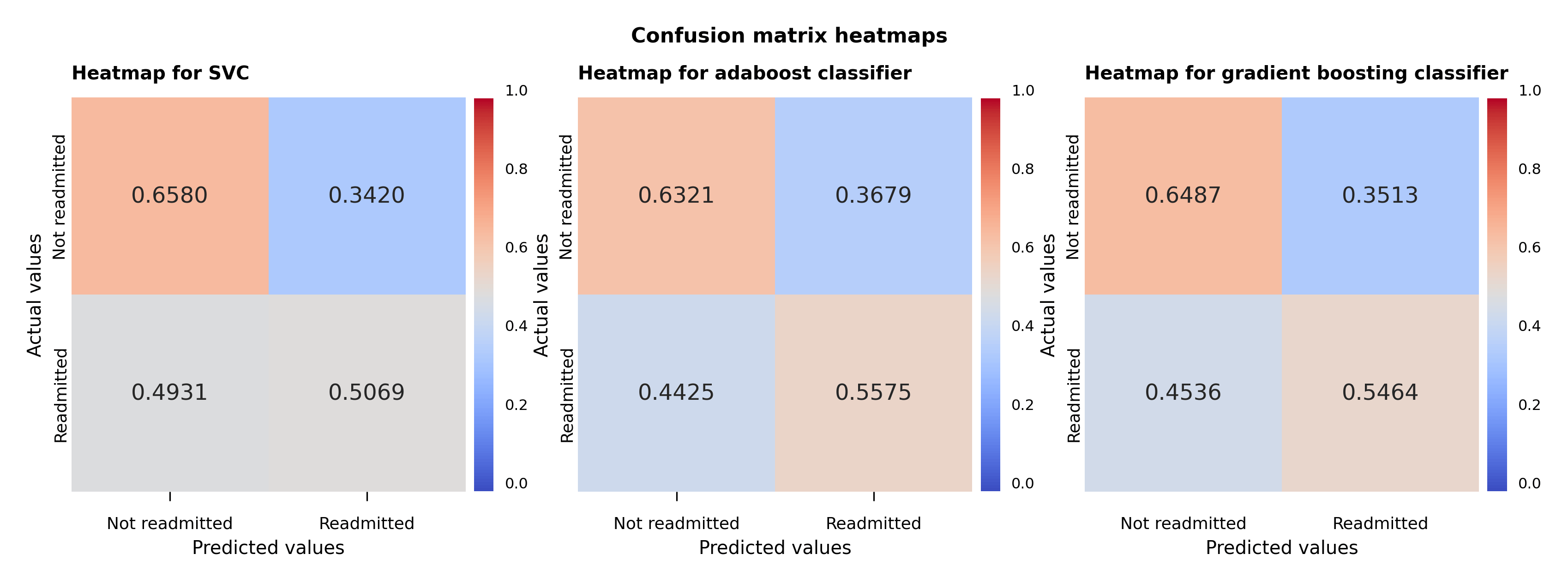
Figure 5 – Support vector, adaboost and gradient boosting classifiers confusion matrix heat maps
ROC curves and AUC #
The receiver operating characteristic curve, or ROC curve, shows the marginal performance of the gradient boosting classifier compared to the other two algorithms. The ROC curve displays the true positive and false positive rates against a series of thresholds that produce these rates, and the best curve is the one that produces the highest true positive rate against the smallest false positive rate for all thresholds. These plots also contain the area under the curve (AUC) calculations in the bottom right corner. The bigger this value is the more snug the ROC curve will be along the left and top axes of the plot. Therefore compared against the AUC value and the ROC curve, the gradient boosting classifier achieves the better performance among the three algorithms used.
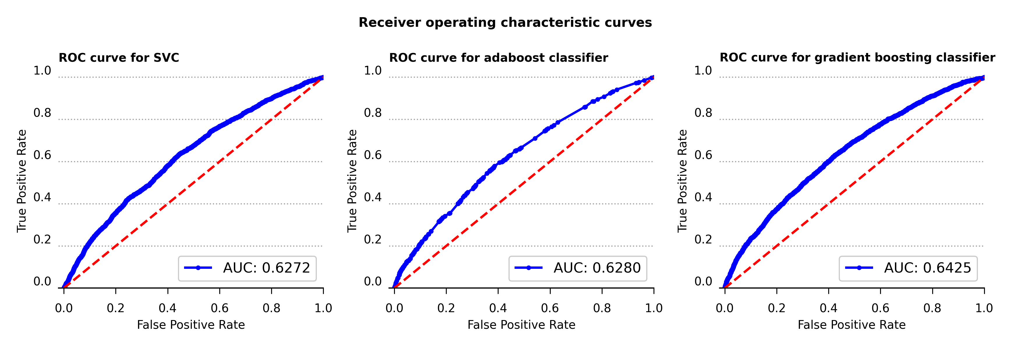
Figure 6 – Receiver operating characteristic curve for support vector, adaboost and gradient boosting classifiers
Learning curves #
To clarify for cases of possible model overfitting or underfitting, the learning curves with one standard deviation error bands are calculated for all three models (Figure 7). For the classification problem at hand, accuracy is the metric used to determine the error in the model performance.
As can be seen in the plots below, while all three algorithms don’t produce high values in accuracy none appear to be overfitting or underfitting. The support vector and gradient boosting classifiers acheve slightly higher results in accuracy compared to the adaboost classifier.
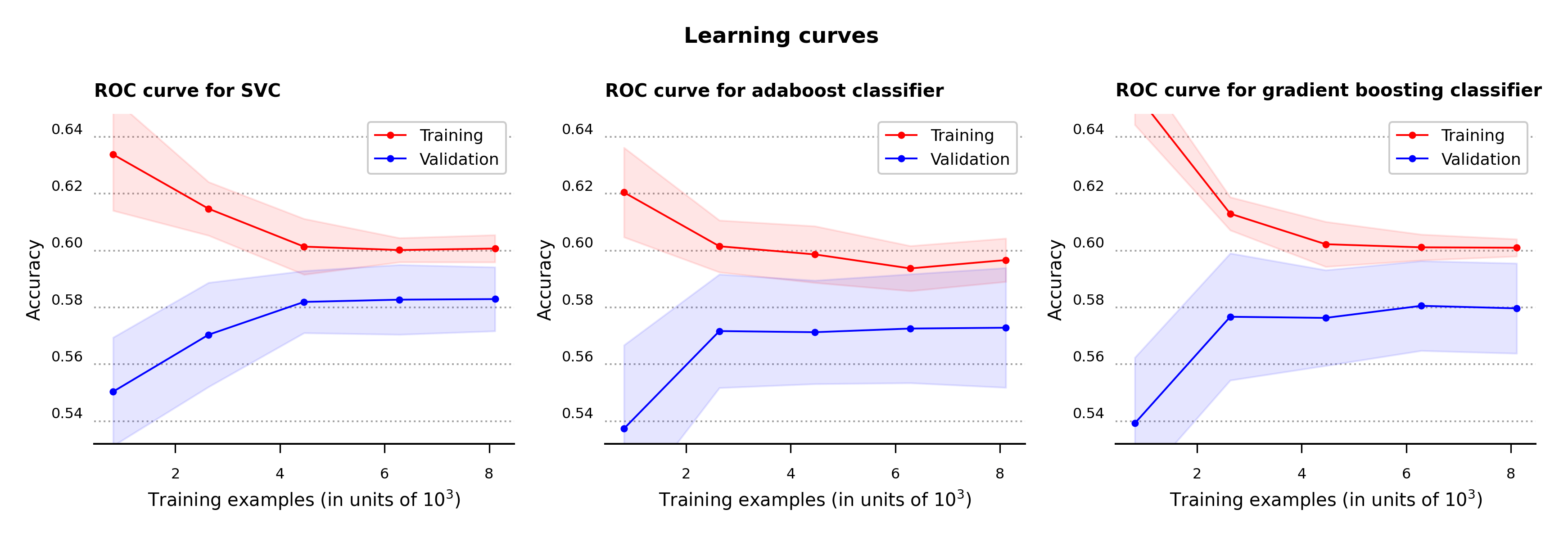
Figure 7 – Learning curves for support vector, adaboost and gradient boosting classifiers
As seen so far, all three algorithm are fairly similar to one another in their metric values. However the gradient boosting classifier is marginally better at some metrics compared to the others, so I’m going to use it to determine the most important feature values. Let’s now use this model to calculate the features that are most likely to determine hospital readmission.
Permutation importance #
The normalized feature importance plot calculated by feature permutation is shown below in Figure 8, and highlights the features that are most influential for hospital readmission. The discharge_disposition_id and service_use features are the ones that appear to be more helpful in determining readmission cases. As mentioned in the main reference article for this analysis, primary_diag also bears some relationship with the possibility of readmission, even though its contribution is much weaker than the first two features. The boxplot shows the 25-to-75 percentile interquartile range of each feature, which particularly showcases the features that are related to readmission. The feature importances were calculated using permutation_importance function from Scikit-Learn using the fitted gradient boosting classifier algorithm as the estimator.
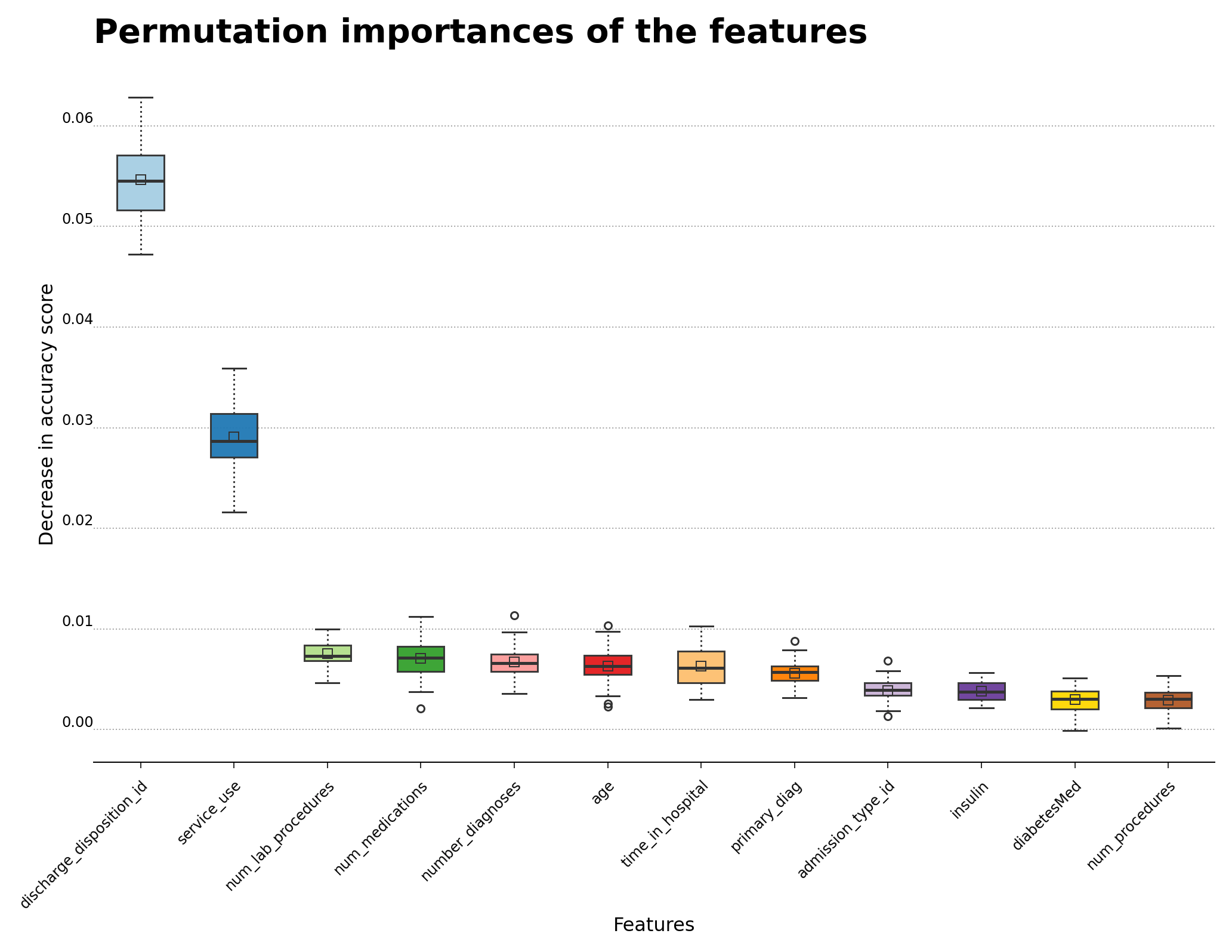
Figure 8 – Permutation importance for feature evaluation using the gradient boosting classifier algorithm
Conclusions #
The challenge of this analysis was to confront the large number of categorical features and the large ratio of not-readmitted to readmitted cases in the data. The gradient boosting classifier slightly outperforms the other two models, but the other algorithms follow closely behind the gradient boosting algorithm. Due the high cardinality of the categorical features in the data set, a possible direction to improve the results of the analysis may be to do more aggregation of the categorical features. Please feel free to take a look at the code in my GitHub repository.
Update (2024-05-03): For the latest data analysis, the following software packages were used: scikit-learn (version 1.4.2), pandas (version 2.2.2), matplotlib (version 3.8.4), seaborn (version 0.13.2) and imbalanced-learn (version 0.12.2).